Website Redesign & Information Architecture
Carnegie Museums of Pittsburgh
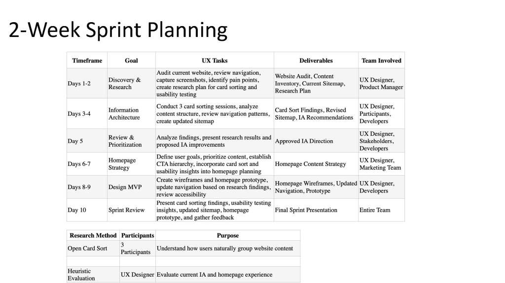
I explored ways to improve the Carnegie Museums of Pittsburgh website experience by simplifying navigation and making ticket purchasing more visible. Using Lean UX methods, I researched the existing information architecture and developed an MVP homepage focused on the primary user goal.
MY ROLE : UX Designer, UX Researcher
TIMELINE : 10-Day Sprint
METHODS : Lean UX, Card Sorting, IA
TOOLS : Figma, FigJam, Slides
THE PROBLEM
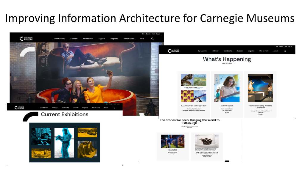
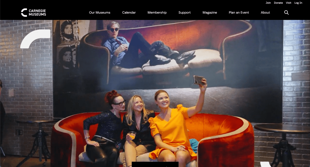
labels and presents several competing priorities on the homepage. Important actions, especially purchasing tickets, can be difficult to identify quickly, creating an opportunity to simplify the experience and better support visitors planning a museum trip.
THE GOAL
Create a more intuitive homepage experience that simplifies navigation, makes ticket purchasing immediately visible, and helps visitors quickly discover relevant museum information.
PROJECT OBJECTIVES
- Increase visibility of ticket purchasing
- Simplify the website navigation
- Reduce competing homepage priorities
- Help visitors discover museum content
- Create a focused, testable MVP
RESEARCH & PROCESS
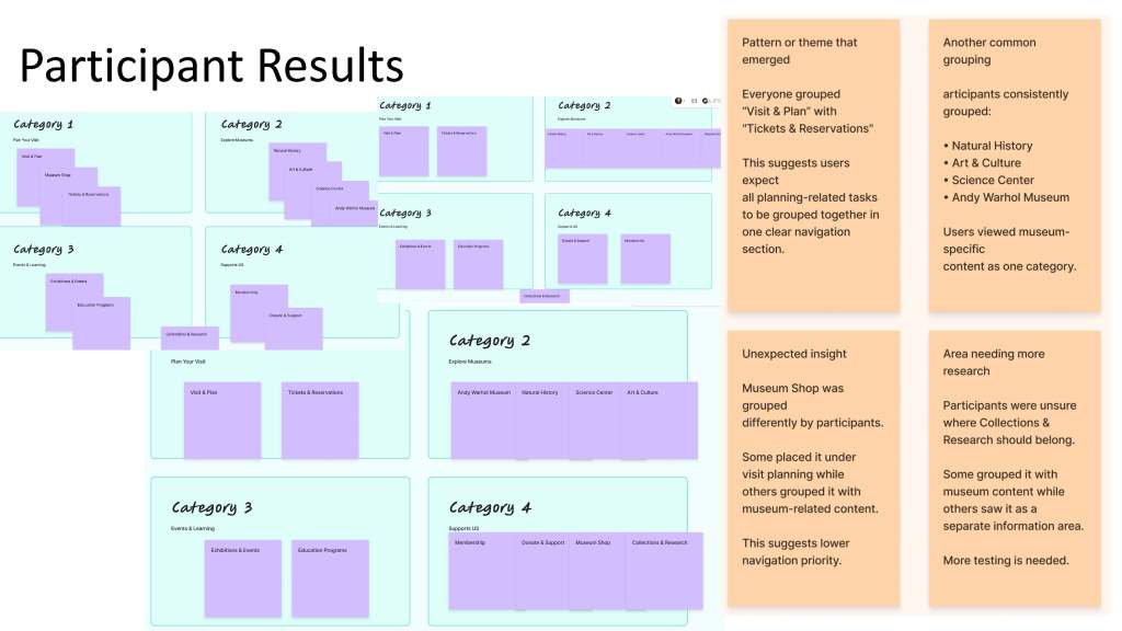
Understanding how users expect museum information to be organized.
CARD SORTING
To better understand how visitors naturally organize museum information, I conducted three in-person open card sorting sessions. Participants grouped website content into categories that made sense to them and created labels based on their expectations.
The research helped identify patterns in how users expected to find information related to planning a visit, exhibitions, collections, education, membership, shopping, and tickets.
KEY FINDINGS
Planning Comes First
Participants grouped practical visitor information, such as hours, locations, accessibility, and planning resources, together, supporting a dedicated Visit & Plan category.
Clear Content Groups
Exhibitions, events, collections, research, and educational content were generally treated as distinct types of information, supporting clearer navigation categories.
Tickets Need Visibility
Ticket-related information should be easy to identify and access rather than buried within broader navigation categories.
Solution & Outcome
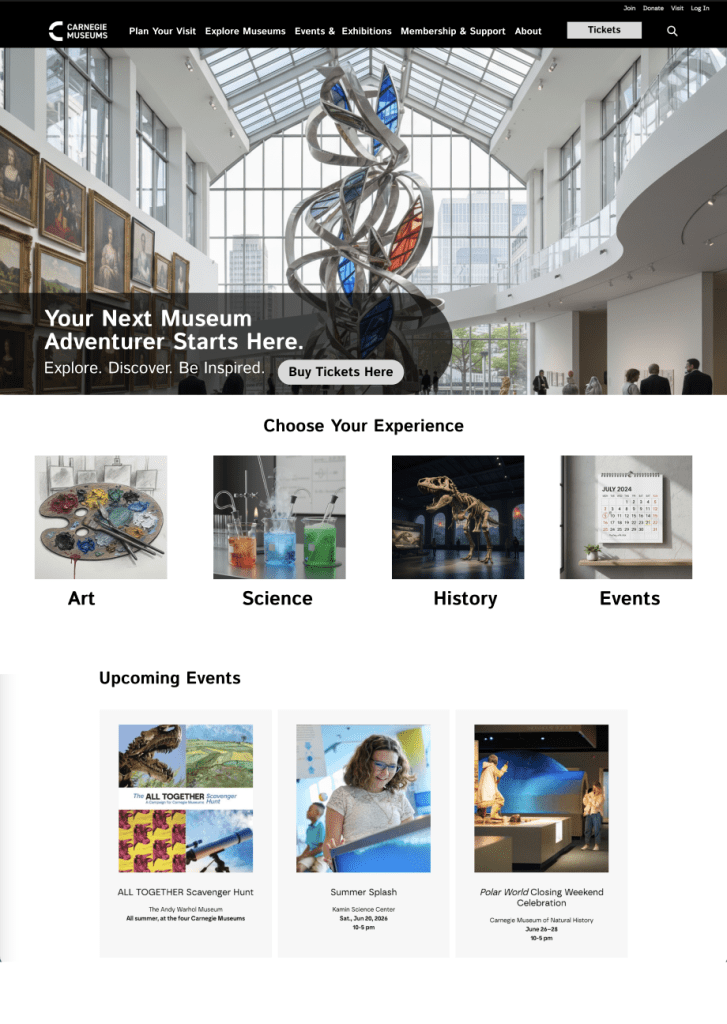
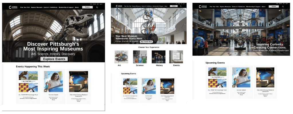
Designing a homepage that puts the primary action, buying tickets, front and center.
before & After
HYPOTHESIS
A single, high-contrast “Buy Tickets Here” CTA will increase ticket clicks and conversions compared with the current homepage.
TARGET / EXPECTED IMPACT
5–20%
Target increase in ticket purchases
To be validated through usability testing and A/B testing.
NEXT STEPS
- Conduct usability testing with target users
- A/B test Design 2 against the current homepage
- Track ticket CTA clicks and conversions
- Explore a unified museum ticket calendar to further support ticket sales
WHAT I LEARNED
This project reinforced the importance of prioritizing the primary user goal instead of trying to improve everything at once. Using research to guide the information architecture helped me create a more intuitive structure and a focused MVP that can be tested, measured, and iterated on.

