“It’s through mistakes that you actually can grow. You have to get bad in order to get good.”
— Paula Scher
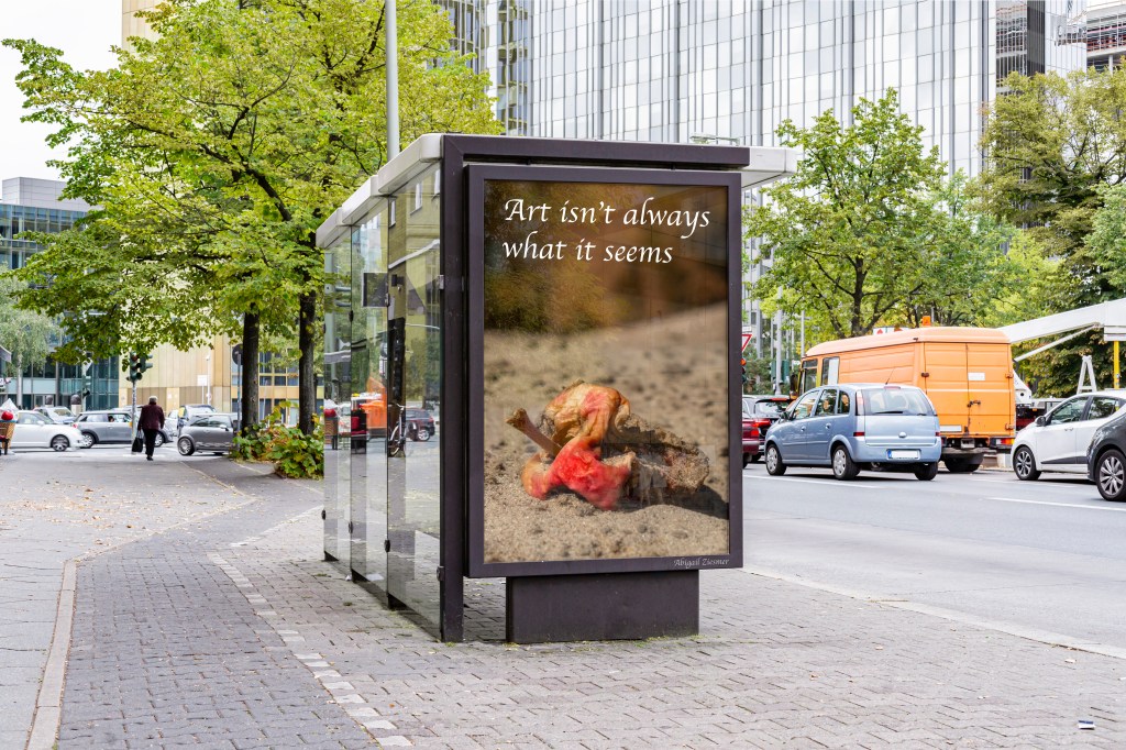
This image showcases a creative blend of photography and digital manipulation. I captured a decaying, half-eaten apple on the beach, recognizing its unexpected artistic quality. By incorporating this photograph into a mock-up of a bus stop advertisement, I transformed the mundane into thought-provoking imagery. The caption, “Art isn’t always what it seems,” reinforces the idea that beauty and meaning can be found in the most unexpected places. The edit effectively merges real-world texture with urban design, making for a striking and unconventional visual statement.
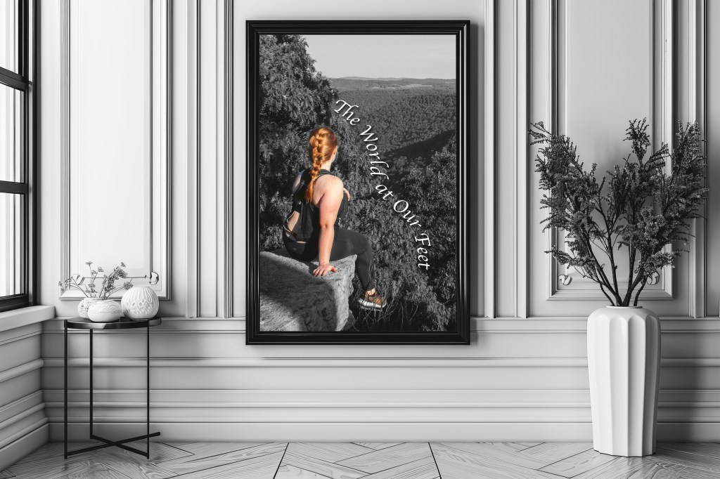
This composition blends stock imagery with my photography, creating a striking contrast between the grayscale background and the subject. The caption, “The World at Our Feet,” reinforces a sense of empowerment and adventure, emphasizing the vast landscape ahead. The black-and-white aesthetic adds depth, making the subject stand out while evoking introspection
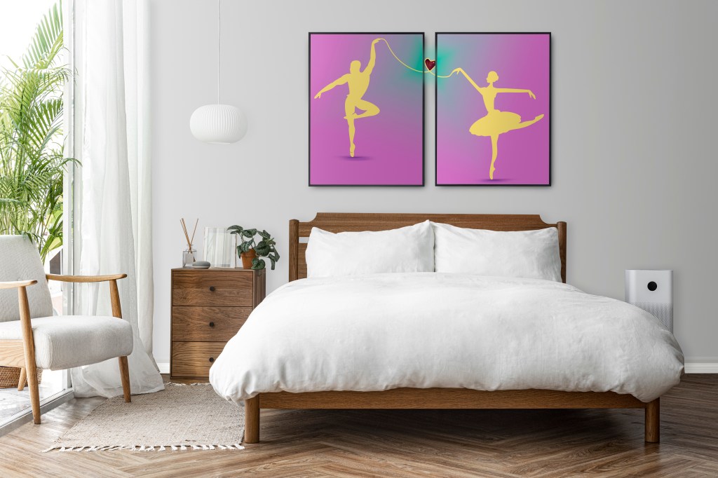
These ballet dancers explores the elegance and emotion of ballet through minimalist silhouettes and a vibrant color palette. Featuring two ballet dancers, the two panels symbolize movement, harmony, and connection. A delicate string linking their hands leads to a glowing heart, representing unity. The bold contrast of yellow silhouettes against a soft pink-to-purple gradient creates a striking visual impact, while the graceful ballet poses add a sense of energy and fluidity. With its modern aesthetic and symbolic depth, this piece is a perfect addition to contemporary interiors, bringing both sophistication and meaning to any space.
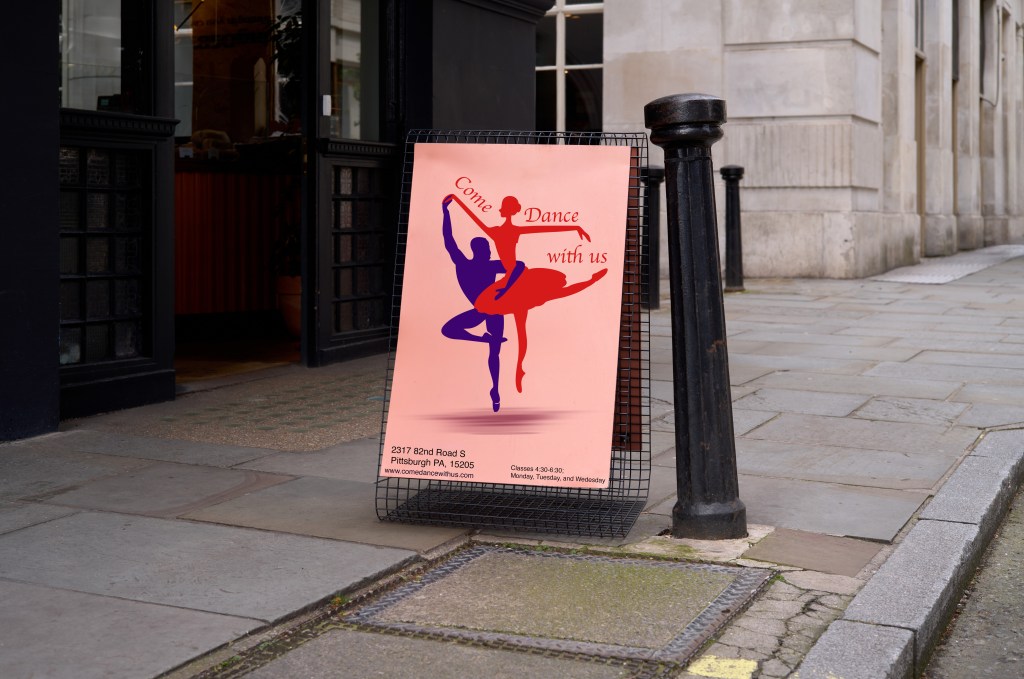
This poster effectively captures the elegance and energy of ballet, using a dynamic composition of two dancers in harmonious movement. The contrasting red and blue silhouettes create a visually striking effect against the warm peach background, drawing attention to the graceful performance. The curved text, “Come Dance with Us,” adds fluidity, enhancing the sense of motion. The minimalist design keeps the focus on the dancers, while the essential details location, schedule, and website are neatly placed at the bottom for clarity. This design successfully conveys an inviting and professional tone, making it an ideal promotional piece for a dance studio or event.
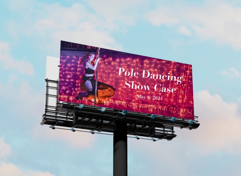
This billboard design effectively captures the excitement and elegance of pole dancing with a striking visual composition. The illuminated backdrop of string lights creates a warm, inviting atmosphere, drawing attention to the central performer in mid-movement. The typography is clean and bold, ensuring high readability from a distance, while the choice of a classic serif font adds a touch of sophistication. The placement of the event details “Pole Dancing Showcase, May 8, 2024” is clear and concise, making it easy for passersby to absorb the key information. This design successfully balances artistry and functionality, making it a compelling promotional piece for the event.